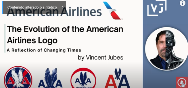
The Evolution of the American Airlines Logo: A Reflection of Changing Times
Logos are more than just a company’s visual identifier; they embody its spirit, ambitions, and adaptation to historical and cultural shifts. The evolution of the American Airlines logo serves as a fascinating lens through which to observe how the company has grown, innovated, and responded to societal and industry changes over nearly a century. Each iteration of the logo tells a unique story, reflecting both the company’s trajectory and the zeitgeist of the times.
1934: The Original Eagle and Bold «AA»
Design: The 1934 logo features a detailed eagle facing left, wings spread in a strong, commanding pose, with the letters «AA» in bold red beside it.
Historical Context: In the early 1930s, the aviation industry was still in its infancy. Air travel was a daring, pioneering endeavor, and American Airlines positioned itself as a bold and ambitious carrier in this new frontier.
Adaptation to the Times: The eagle, a powerful symbol of American pride and strength, aligned with the national spirit during the Great Depression. The bold red «AA» conveyed energy, passion, and determination—essential qualities for a company seeking to instill confidence in a relatively new industry.
Purpose: The intricate and commanding design reflected the company’s aspirations to lead in aviation and connect America by air.
1945: The Right-Facing Eagle and Blue «AA»
Design: The eagle now faces right, symbolizing forward motion and progress, while the «AA» turns blue, a color often associated with trust and reliability.
1962: Blue «AA» with «AMERICAN» Added
Design: The eagle remained, but the «AA» was simplified in a clean blue font, and the word «AMERICAN» was introduced underneath.
Historical Context: The 1960s were defined by the Space Age and the Jet Age. Commercial aviation was becoming a symbol of modernity, speed, and convenience.
Adaptation to the Times: The streamlined design reflected the technological advancements of the era and the growing professionalism of the airline industry. By adding the word «AMERICAN,» the logo emphasized brand recognition, making it clear and direct in a competitive market.
Purpose: This change marked a shift toward simplification and clarity, preparing the airline for rapid expansion in domestic and international markets.
1967: Red and Blue «AA» with a Simplified Eagle
Design: The «AA» letters adopted patriotic red and blue, and the eagle was reduced to a sleeker, more abstract form. The full name «American Airlines» appeared beneath in a modern font.
2013: Modern Simplicity with Abstract Eagle and Airplane Tail
Design: The «AA» letters were dropped entirely, replaced by a sleek wordmark reading «American Airlines» in gray. The logo features an abstract design of an eagle embedded in an airplane tail, combining red, white, and blue.
Historical Context: By 2013, the digital age had transformed branding. Logos needed to be simple, scalable, and recognizable across various digital platforms, from websites to mobile apps.
Conclusion: A Logo That Soars with Time
The American Airlines logo tells a story of resilience, innovation, and adaptation. Each change reflects not just the airline’s growth but also its ability to anticipate and respond to broader societal shifts.
In the 1930s, the logo embodied ambition and patriotism during a challenging economic time. Post-World War II, it signaled trust and forward momentum. The Space Age and Jet Age brought a streamlined, modern look, while the digital era demanded simplicity and versatility.
The 2013 redesign stands as a testament to the company’s commitment to progress. By merging traditional symbolism with modern design principles, the logo bridges past and future, showcasing American Airlines as a brand ready to lead in a fast-changing world.
The journey of the American Airlines logo serves as an inspiration for brands everywhere: to honor their heritage while embracing the future with boldness and creativity.


